Text
Overview
The Text widget displays single or multi-line text on a dashboard. Supports static content, field binding, and expressions.
| Item | Value |
|---|---|
| Library path | Basic → Text |
| Use cases | Titles, labels, dynamic status text |
Add widget
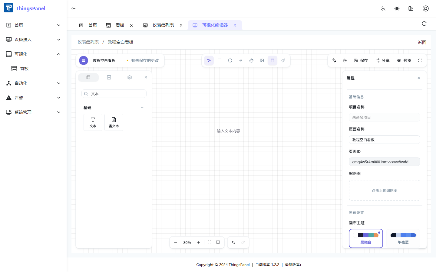
- Open the dashboard Edit view.
- Find Text under Basic in the component library, or search for it.
- Drag the widget onto the canvas and release.
Properties panel
Select the text widget to configure it in the right Properties panel.
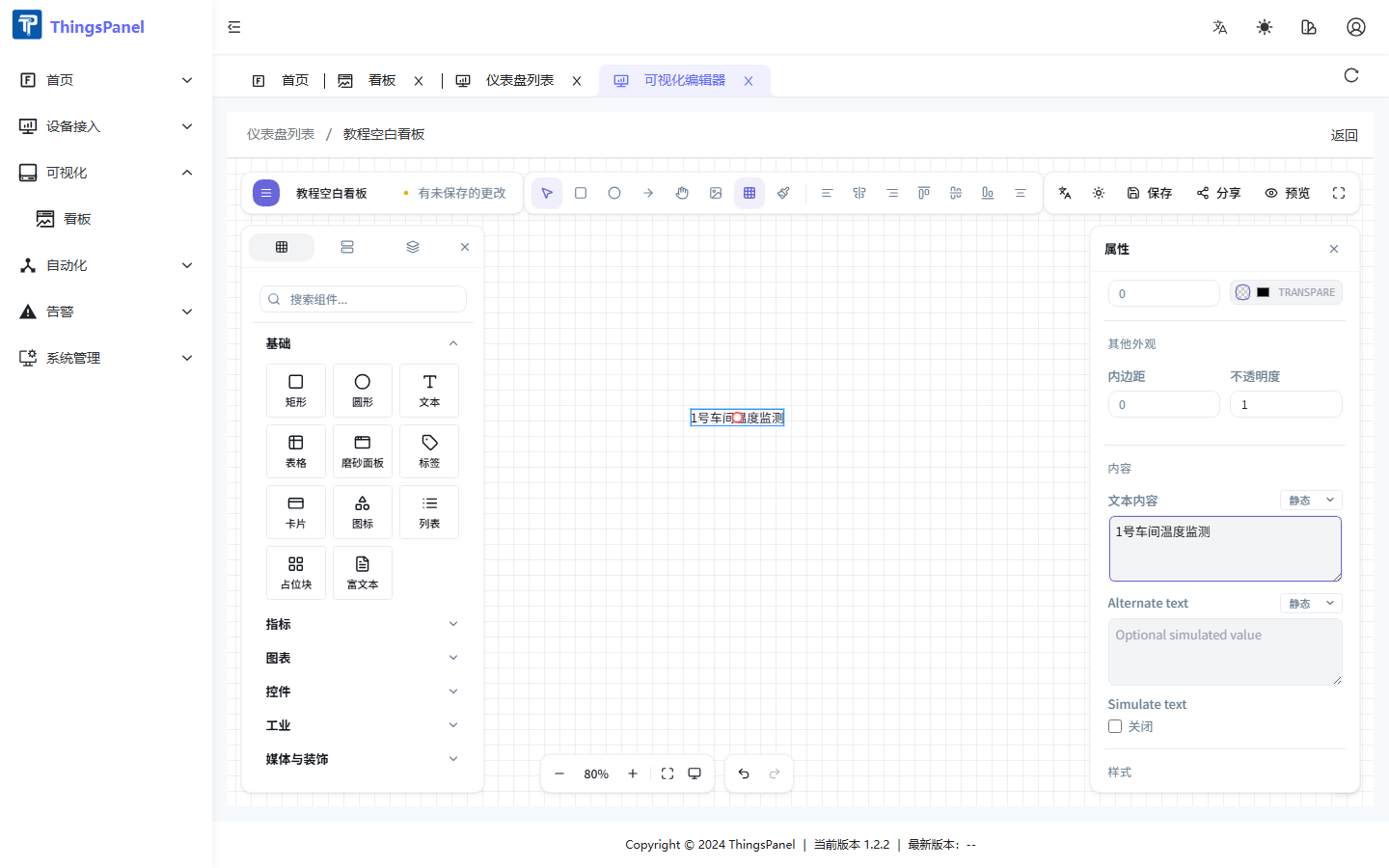
Content
| Property | Description |
|---|---|
| Text content | Displayed text; switch Static / Field / Expression via the dropdown |
| Alternate text | Fallback text, also supports binding modes |
| Simulate text | Rotate displayed content at an interval for demos |
Font & layout
Font size (8–200 px), family, weight, style, horizontal/vertical alignment, line height, letter spacing, and text decoration.
Style
Text color and optional shadow (color, blur, offset).
Data binding
- Select the text widget.
- Switch Text content to Field.
- Configure the field picker to choose data scope and field.
- Optionally add a data transform expression.
Canvas shortcuts
| Action | Shortcut |
|---|---|
| Move | Drag |
| Delete | Delete |
| Copy | Ctrl+C / Ctrl+V |
| Undo | Ctrl+Z |